A friendly digital guide to discovering, booking, and exploring Education City in Doha.
EDUCATION CITY
THE CHALLENGE
Education City in Qatar is not a single destination. It is a 12 square kilometre campus that brings together world-class universities, research institutions, sports facilities, cultural venues, parks, and community spaces. On any given day, people come to attend a lecture, book a gym class, visit an exhibition, take their kids to an event, or simply spend time outdoors.
The Education City mobile app and website were meant to be the digital front door to all of this. Over time, they had become dated, inconsistent, and difficult to use. Core tasks like discovering events, booking classes, filtering activities, or checking in were harder than they should have been. Important information was often missing or buried, and the overall experience did not reflect the vibrancy or ambition of Education City as a place.
With the FIFA World Cup 2022 approaching, over a million visitors were expected in Qatar, many of whom would be visiting Education City for the first time. The brief was clear but demanding: improve the core experience for residents and tourists, redesign the mobile app and website, and create a visual identity and design system aligned with Education City’s updated brand, all within a six month timeline shared with development.
Organisation
Systems Limited
Client
Qatar Foundation
Timeline
6 months
Role
Lead UX/Service Design Strategist
My Role
I joined the project as Lead UX Design Strategist. I led the overall experience strategy, research direction, and design decision-making, while managing a team of two UI designers, one UX designer, and one front-end designer, with specialist support from within the studio when needed. I worked closely with stakeholders at Education City and Qatar Foundation, and facilitated regular working sessions with focus groups.
LEARNING
Understanding what was broken
We began with a detailed UX audit of the existing Education City app and website. We mapped every core journey and broke each screen down into its functional elements. This helped us pinpoint friction in tasks that happened hundreds of times a day, such as browsing events, searching, filtering, booking, checking out, and checking in.
What emerged was not a single failure point, but many small ones adding up. The homepage did not use its space well. The information hierarchy was unclear. The difference between events, classes, activities, and venues was inconsistent. The visual language felt dated and disconnected from Education City’s cultural identity.


Mapping real user complexity
Booking on Education City was deceptively complex. Users could book as individuals or groups. Groups could include residents and guests. Different activities had different pricing models, consent requirements, and eligibility rules. These variations also created dozens of edge cases that the existing experience did not handle cater to effectively.
We created combined user journey maps to visualise this complexity end to end. These journeys helped the team and stakeholders keep the big picture in mind while working on individual parts of the experience.

Two audiences, two ways of using Education City
We conducted interviews with a mix of Education City residents and visitors:
- Residents talked about recurring friction such as finding the right sports classes, booking recurring sessions, and discovering new events beyond their usual routines.
- Visitors were more focused on orientation. They wanted to know what was nearby, what was worth their time, and how to get from one point to another without too much effort or uncertainty.
The existing experience attempted to serve both audiences without clearly supporting either mode of use. Discovery, planning, and booking were treated as isolated actions rather than parts of a continuous journey. Understanding distinct usage patterns clarified that the platform needed to support both routine participation and first-time exploration within a single coherent structure.
Learning from familiar mental models
From usage data and prior research, it was clear that users approached the Education City app with expectations shaped by modern booking platforms like Airbnb or TripAdvisor. People expected to browse visually, filter quickly, compare options, book confidently, and receive clear confirmation.
We conducted a competitive review of well-reviewed booking and event apps and created a moodboard of common interaction patterns. This was not about copying features, but about aligning with mental models users already trusted.

DESIGNING
With a clear understanding of the problem space, our design work focused on structure, iteration, and validation. The goal was not to design everything at once, but to progressively remove uncertainty from the most critical journeys while building a foundation that could scale beyond the initial release.
Fixing the structure before fixing the screens
The first major intervention was rebuilding the information architecture.
- Card sorting exercises helped reorganise activities into clearer categories. Overlaps were reduced. Labels were simplified. Groupings reflected user mental models rather than internal classifications.
- The navigation model was restructured to reduce depth and redundancy. Primary pathways surfaced key actions early, allowing users to reach meaningful content quickly.
- A new sitemap clarified relationships between activity types, services, and utilities. This created predictable movement across the platform.

Rapid prototyping
Given a shared timeline with development, design and engineering progressed in parallel. This required disciplined iteration and clear approval cycles to prevent rework while maintaining quality.
Low-fidelity sketches were used to quickly test structural ideas, particularly around discovery and filtering. We explored how someone might search for a free, family-friendly activity happening that day, and how the experience could move fluidly from browsing to booking.
Concepts that demonstrated clarity were translated into wireframes and reviewed in structured weekly sessions with stakeholders. This created an agreed rhythm of iteration, reducing ambiguity and keeping marketing, technical, and operational teams aligned as decisions were made.

Bridging digital design with operational reality
A central part of the work involved reconciling digital booking flows with how activities were actually delivered on the ground. Through service blueprinting, we mapped frontstage user journeys against backstage systems, CMS structures, booking management workflows, and staff processes. This surfaced mismatches early, including inconsistent activity data, manual confirmation dependencies, and late updates to on-ground details.
Where operational systems could not be changed, the experience was designed to communicate clearly and handle edge cases gracefully. Where alignment was possible, workflows were adjusted to better support digital planning. This ensured the redesign would not simply look better, but function reliably in practice.

Establishing a scalable visual and structural language
In parallel with journey restructuring, we developed a visual direction aligned with Education City’s refreshed brand identity. We explored how the new experience should look and feel. Using extensive moodboarding, we tested a wide range of visual directions, from glass-like treatments to flat minimal styles, always checking against Education City’s updated brand guidelines.
After dozens of iterations, we landed on a visual direction that felt modern, welcoming, and culturally grounded. This became the foundation for a reusable design system.


DELIVERY
The redesign focused on transforming the platform from a content container into a decision-support product.
Three strategic priorities guided the work:
- Organise content so people can quickly understand what is available and where to begin.
- Design journeys around real decision patterns rather than internal content hierarchies.
- Ensure discovery, booking, planning, and access work as a continuous flow.
A new design language
A new unified design system ensured consistency across Education City’s mobile and web platforms. Typography, use of colours and the visual style was aligned the refreshed EC identity and a modular component library supported reuse across navigation, discovery, booking, maps, itineraries, and digital passes. The design system established a uniform foundation that brought structure and cohesion to Education City’s current and future digital experiences.

A homepage designed for exploration
We redesigned the homepage to feel inviting, vibrant, and alive, matching Education City’s energy and refreshed identity.
Four primary actions at the top:
-
- Go to an event
- Join a class
- Book a tour
- Book a venue
A Spotlight carousel featured high-priority activities and improve discoverability while thematic browsing sections (seasonal/editorial groupings like “Fun in the Sun”, “Family Friendly”) were added so the homepage always had something new to offer. Quick view on cards allowed users to preview details without committing to a full screen transition and a bottom navigation bar was added for consistent movement across sections.


Structuring the ecosystem around Activities
Events, Classes, Tours, and Venues were unified under a single conceptual model: Activities.
This structure aligned the digital experience with user mental models while also helping internal teams organise content consistently. Users no longer needed to understand organisational boundaries. Every interaction began with something to do rather than where it belonged administratively.
Dynamic filtering adapted to each activity type, allowing discovery to feel tailored without introducing unnecessary complexity. Users browsing classes encountered filters like level or duration, while venue exploration focused on capacity or suitability.
Discovery became intuitive rather than procedural.
Restoring confidence in booking
Booking was redesigned to reduce uncertainty and mirror real-world planning behavior.
Key information surfaced earlier, progress became visible throughout checkout, and users could confidently understand what they were committing to at each step. The flow supported multi-person bookings, reflecting how families and groups actually participated in Education City activities.
Payment remained in-app, and tickets became portable by default, simplifying entry and participation. Digital e-cards and memberships centralized essential credentials in one place, enabling quick entry through QR-based check-ins and removing the need for separate physical verification steps.
Designing for the day-of experience
Planning did not end at checkout. Users needed support navigating Education City once activities were booked.
My Itinerary was introduced as a day-based companion experience, helping users understand what was happening next and where activities were located relative to each other. By pairing timelines with map orientation, the platform reduced last-minute uncertainty and supported smoother movement across the campus.
Making failure understandable
Given existing operational and connectivity constraints, designing for failure was as important as designing for success.
Clear system states were introduced for missing information, connectivity loss, empty results, and system errors. Rather than leaving users uncertain, the experience explained what had happened and what to do next.


IMPACT
During testing and after launch, users spent longer exploring the platform, navigated across more categories, and increasingly discovered activities they had not initially planned to attend. Booking behavior became more spontaneous, reflecting growing confidence that digital information could be trusted.
The redesigned experience transformed how Education City was discovered, planned, and experienced both digitally and operationally. The platform supported Education City during the FIFA World Cup 2022 period, successfully serving large numbers of first-time visitors while continuing to support residents’ everyday use. The system remains in active use today, with ongoing feature expansion building on the foundations established during the redesign.
REFLECTION
Education City reinforced an important lesson about designing complex services: people rarely experience organisations the way organisations are structured.
Internally, Education City operated through multiple teams, venues, and operational systems. Visitors and residents, however, approached it with a far simpler question: What can I do today? The success of the redesign came not from simply adding features, but from aligning digital experience, operational workflows, and organisational thinking around that human perspective.
The project highlighted how trust is built through predictability. When discovery feels clear, booking feels reliable, and systems communicate honestly even when constraints exist, users stop thinking about the technology and start focusing on participation itself.
Education City ultimately reframed my understanding of digital transformation. Successful experiences do not emerge from isolated products. They emerge when organisations learn to present complexity in ways that feel simple, coherent, and welcoming to the people they serve.
Explore More Work
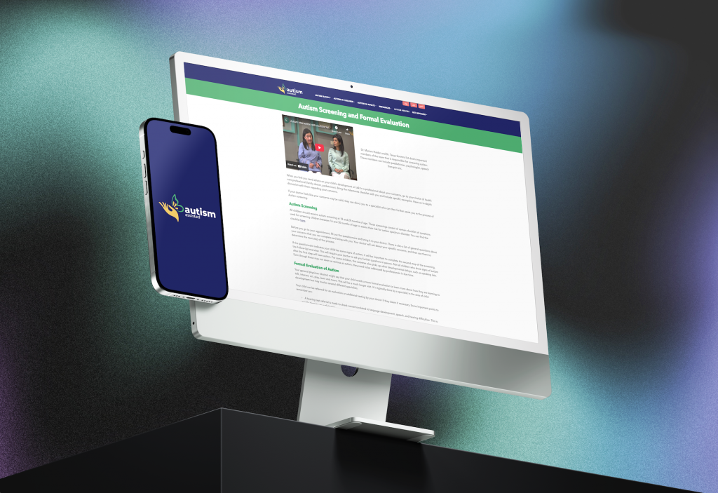
Autism Assisted
Autism Assisted
Punjab Zameen